Light theme
Default color tokens.
A reimagined alternative to Bootstrap and Tailwind CSS. Build modern interfaces with both utility classes and ready-to-use components. Free and open-source.
https://cdn.jsdelivr.net/gh/getfinalui/finalcss@main/css/final.min.css
Rendered examples with the exact HTML below each preview. Use components for the base UI, then adjust details with utilities.
Semantic colors adapt when a parent uses dark mode.
Default color tokens.
Same component classes.
<div class="d-grid grid-cols-2 max-sm:grid-cols-1 gap-4">
  <article class="card card-body bg-base">
    <div class="d-flex justify-content-between align-items-start gap-3 mb-4">
      <div>
        <h5 class="mb-1">Light theme</h5>
        <p class="text-secondary mb-0">Default color tokens.</p>
      </div>
      <span class="badge badge-green">Live</span>
    </div>
    <button type="button" class="btn btn-primary">Open project</button>
  </article>

  <article class="theme-dark card card-body">
    <div class="d-flex justify-content-between align-items-start gap-3 mb-4">
      <div>
        <h5 class="mb-1">Dark theme</h5>
        <p class="text-secondary mb-0">Same component classes.</p>
      </div>
      <span class="badge badge-blue">Dark</span>
    </div>
    <button type="button" class="btn btn-default">Open project</button>
  </article>
</div>Use breakpoint prefixes to change layout without extra CSS.
grid item
grid item
grid item
<div class="d-grid grid-cols-3 max-lg:grid-cols-2 max-sm:grid-cols-1 gap-4">
  <div class="p-4 rounded bg-blue-100">
    <h6 class="mb-1">Analytics</h6>
    <p class="mb-0 opacity-70">grid item</p>
  </div>
  <div class="p-4 rounded bg-green-100">
    <h6 class="mb-1">Billing</h6>
    <p class="mb-0 opacity-70">grid item</p>
  </div>
  <div class="p-4 rounded bg-purple-100">
    <h6 class="mb-1">Support</h6>
    <p class="mb-0 opacity-70">grid item</p>
  </div>
</div>Use component classes for consistent size, color, and states.
<button type="button" class="btn btn-primary">Primary</button>
<button type="button" class="btn btn-blue">Blue</button>
<button type="button" class="btn btn-green">Green</button>
<button type="button" class="btn btn-red">Red</button>
<button type="button" class="btn btn-orange">Orange</button>
<button type="button" class="btn btn-purple">Purple</button>
<button type="button" class="btn btn-teal">Teal</button>
<button type="button" class="btn btn-primary-subtle">Subtle</button>
<button type="button" class="btn btn-outline">Outline</button>
<button type="button" class="btn btn-default">Default</button>Build common marketing and app forms with cards, inputs, buttons, and spacing utilities.
Short CSS and UI tips for building cleaner interfaces.
<article class="card card-body mx-auto" style="max-width: 440px;">
  <span class="badge badge-orange mb-3">Weekly update</span>
  <h5 class="mb-2">Design notes in your inbox</h5>
  <p class="text-secondary">Short CSS and UI tips for building cleaner interfaces.</p>

  <label class="form-label" for="newsletterEmail">Email address</label>
  <div class="d-flex max-sm:flex-col gap-2">
    <input class="form-control" id="newsletterEmail" type="email" placeholder="you@example.com">
    <button type="button" class="btn btn-primary">Subscribe</button>
  </div>
</article>Compose product UI with layout, color, size, text, and button utilities.
Starter components and utilities.
<article class="card overflow-hidden mx-auto" style="max-width: 360px;">
  <div class="h-45 bg-neutral-200 d-flex align-items-center justify-content-center">
    <div class="w-20 h-20 rounded bg-primary"></div>
  </div>

  <div class="card-body">
    <div class="d-flex justify-content-between align-items-start gap-3 mb-3">
      <div>
        <h5 class="mb-1">Workspace kit</h5>
        <p class="text-secondary mb-0">Starter components and utilities.</p>
      </div>
      <span class="badge badge-green">$29</span>
    </div>
    <div class="d-flex gap-2">
      <button type="button" class="btn btn-primary flex-grow">Buy now</button>
      <button type="button" class="btn btn-default">Details</button>
    </div>
  </div>
</article>Elements created with Final CSS utility and component classes.
Customize everything to match your brand style.
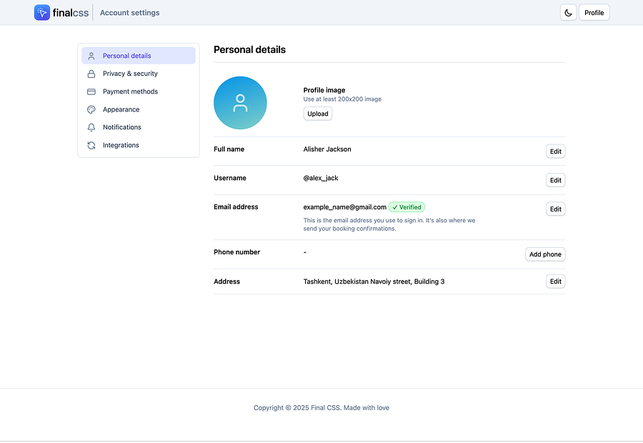
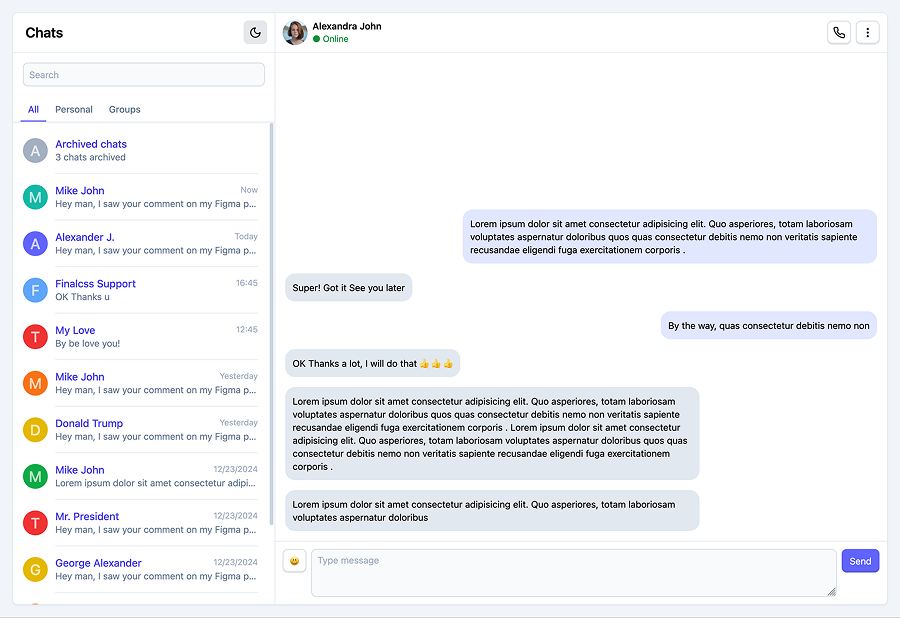
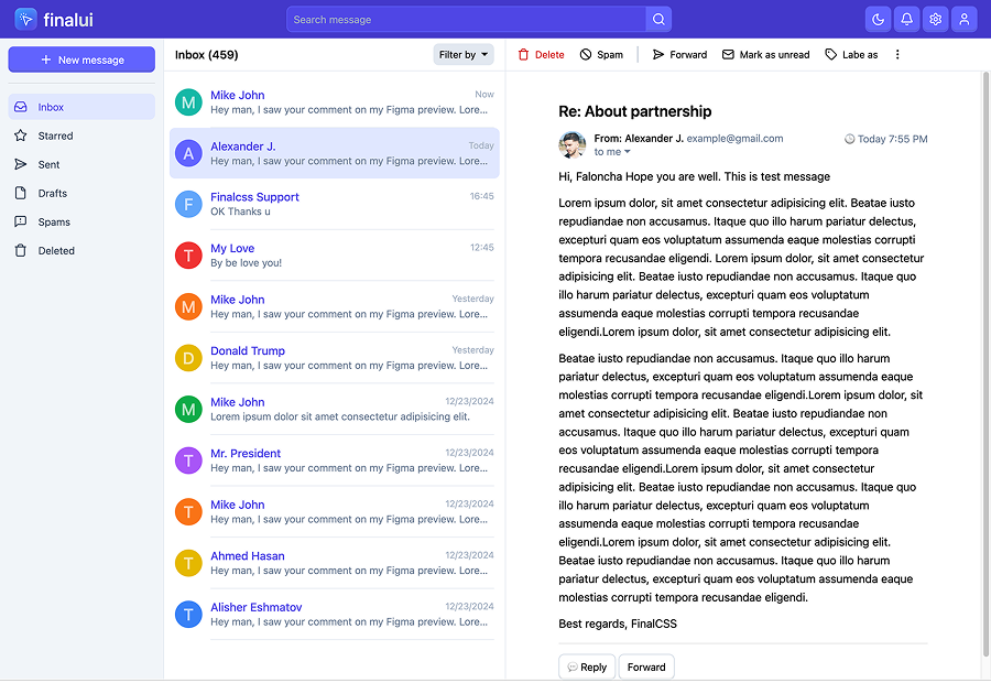
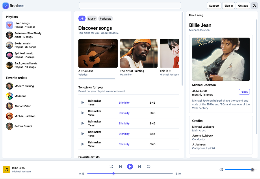
Modern website templates, crafted with Final CSS
Final CSS is more lightweight, has no JavaScript dependency, and includes simplified components with additional utility classes. It is redesigned with cleaner, more aesthetic defaults. If you have used the Bootstrap framework, you have probably faced challenges like overriding styles or changing SCSS variables. Both can be time-consuming and frustrating. Final CSS is built to make that work simpler.
I have used Bootstrap for hundreds of projects. It provides customizable SCSS variables and separate Sass files for each component. You can also use CSS directly from a CDN, which is great, but...
text-bg-primary, bg-primary, --bs-primary-rgb, and --bs-primary-text-emphasis all require documentation.Tailwind is great, and many large companies use it. Still, many developers complain about it.